Making connected archery easier to understand
BowLab connects to Bluetooth-enabled arrow nocks—the pieces that connect an arrow to the bowstring—to capture shot performance data. At MojoTech, I redesigned its mobile experience around three connected tasks: configuring equipment, identifying and finding nocks, and understanding shot results.
- Product Design
- Mobile App
- Connected Devices
- Role
- Lead product designer
- Team
- Designer, product manager, and engineer
- Timeline
- Four-week discovery, followed by approximately two months of design and development support
- Result
- I carried the redesign from discovery into implementation support and QA. My involvement ended before launch.
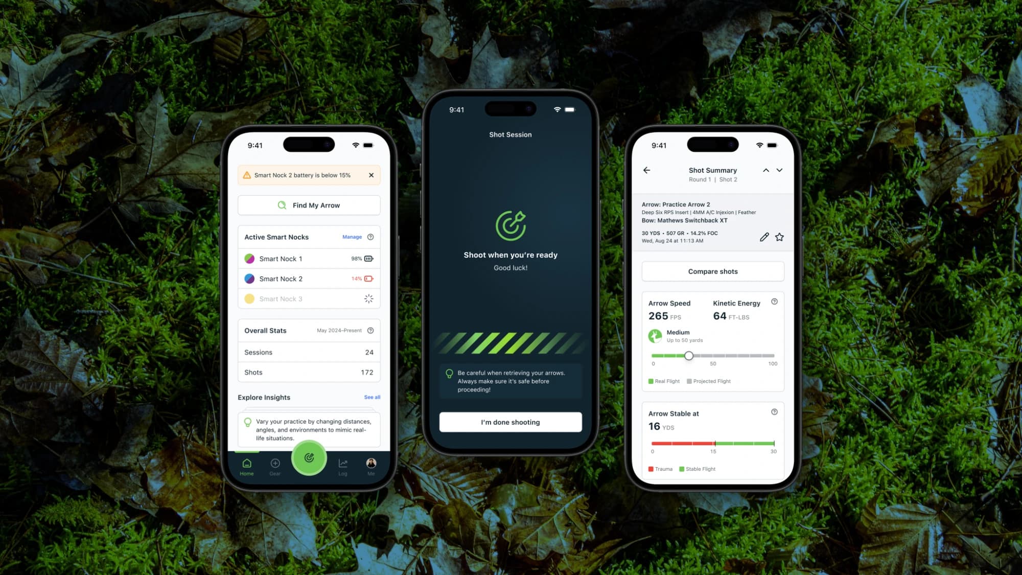
A working device with a fragmented app experience
BowLab had working hardware and an app developed in partnership with the nock’s inventor. The app exposed equipment details and shot measurements, but organizing those capabilities into a coherent experience remained a challenge.
Arrow components were managed separately, nock lighting had its own terminology, and results combined dense measurements and charts. I focused the redesign on connecting these parts of the experience, from configuring an arrow to reviewing its performance.
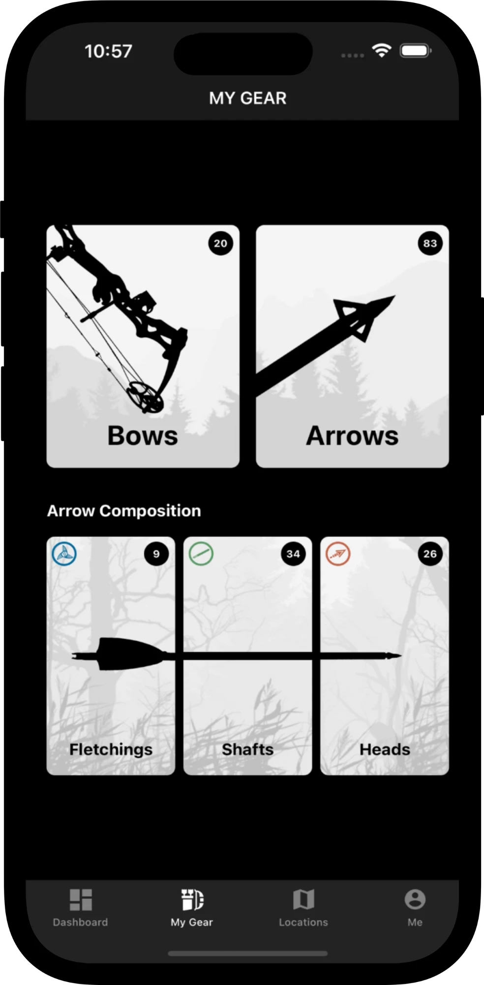
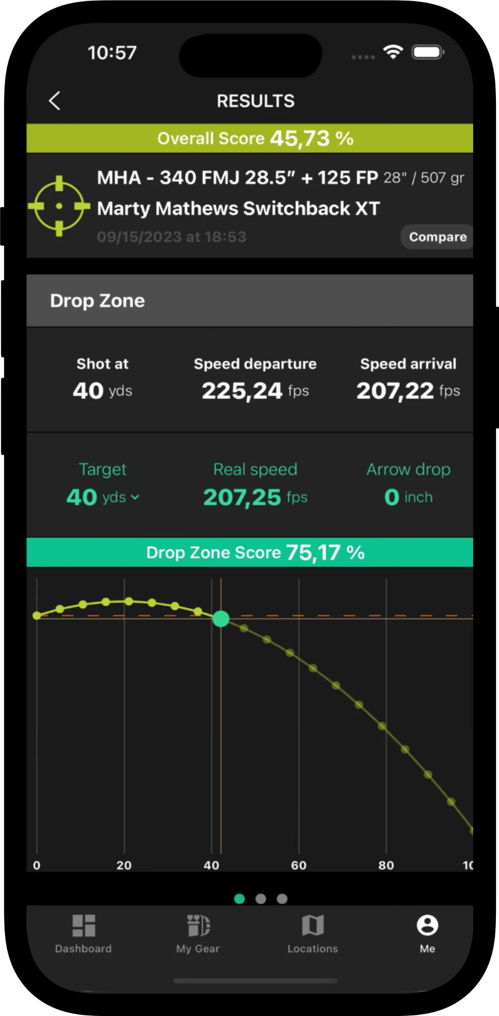
Original experience / The original app separated arrow components into individual management areas and presented shot results through multiple measurements and charts.
Understanding the equipment and the information that mattered
Stakeholder conversations and interviews with bowhunters and archers helped us understand the technology and the information users valued. With no direct competitors identified for a connected archery nock, I also explored wearables and activity trackers for approaches to device pairing and performance data.
I translated that exploration into initial designs during discovery, then developed the experience through regular stakeholder reviews as implementation progressed.
Organizing setup around a complete arrow
The original “Add Arrow” flow depended on components created elsewhere. A user could begin adding an arrow, then encounter an alert requiring a head, shaft, and fletching to be created first.
I brought component configuration into the “Add Arrow” flow, so users could define a complete arrow in one place.
Interviews revealed that archers and bowhunters often had multiple arrows with the same build. We shifted reuse from individual components to complete arrows: users could duplicate an existing arrow from the Gear list instead of selecting the same components for each new build.
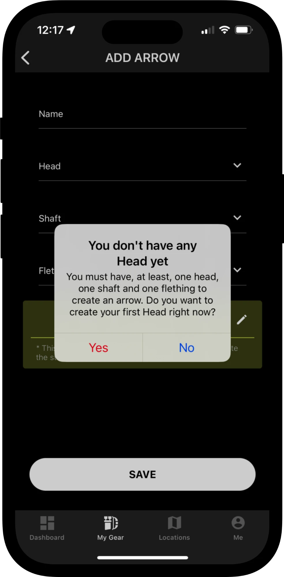
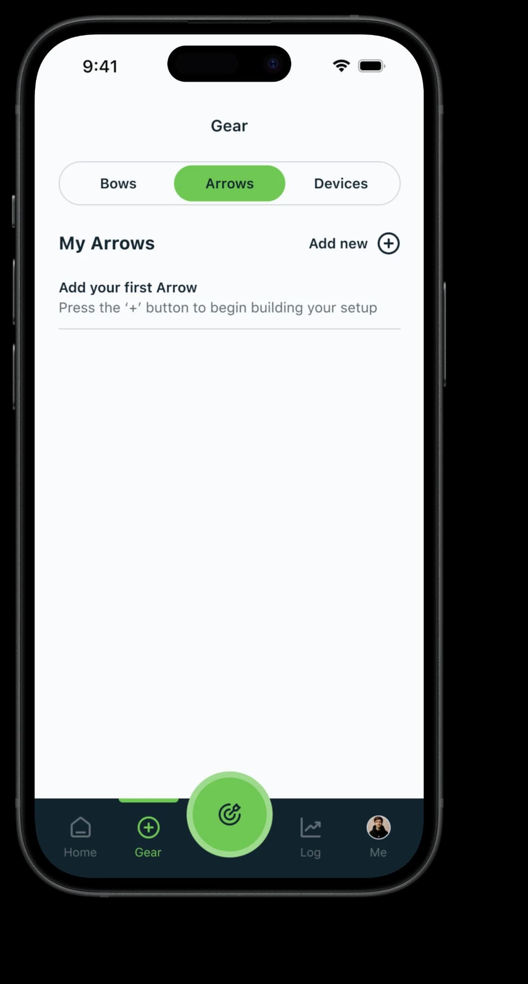
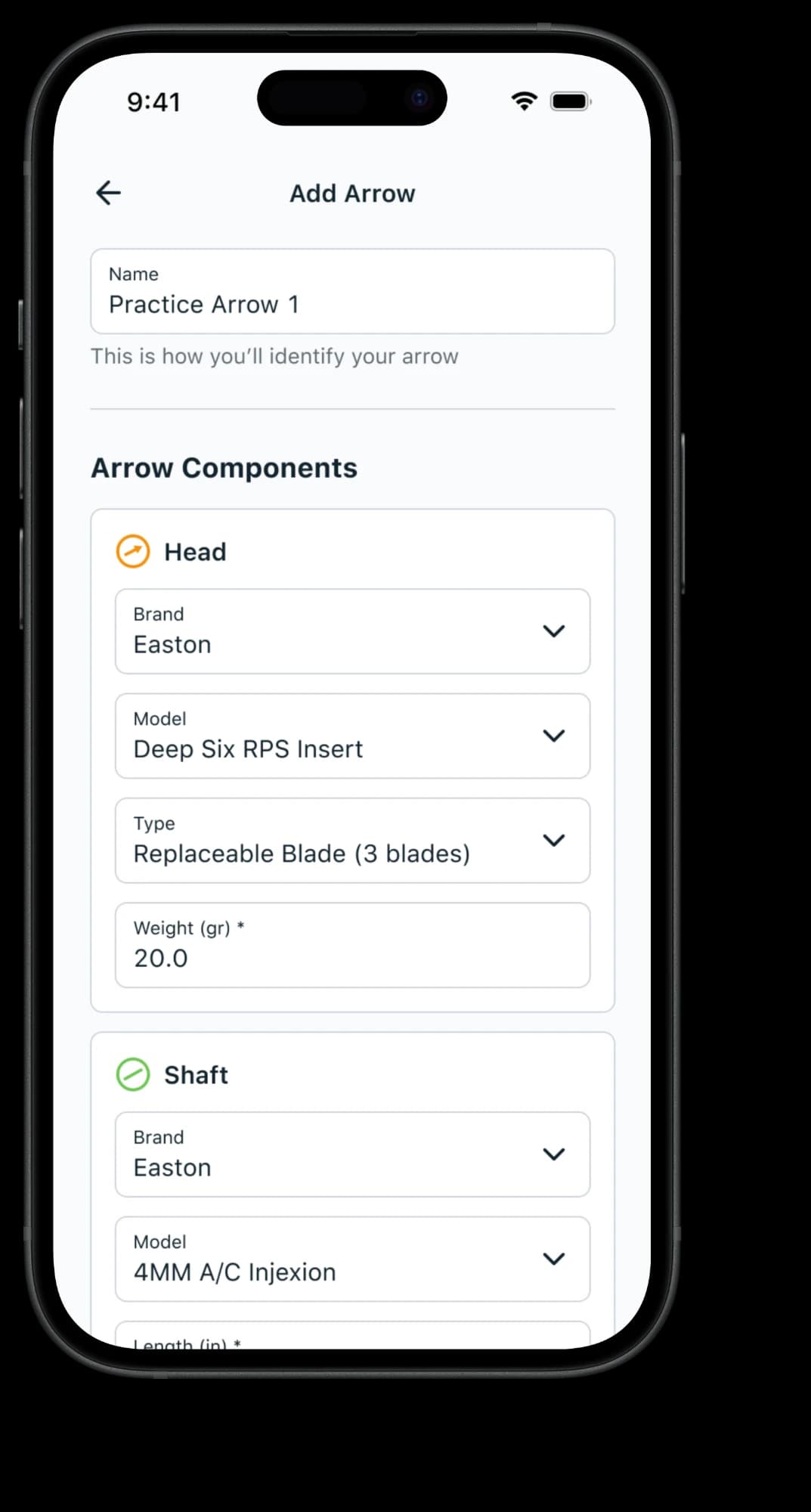
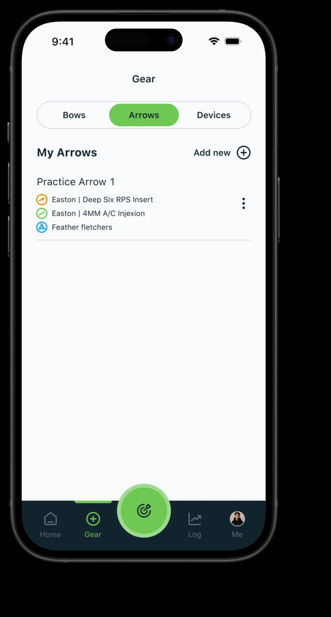
Gear setup / Before, adding an arrow could require creating components elsewhere. The redesign brings component configuration into one flow and lets users duplicate complete arrows for repeated builds.
Bringing nocks and their settings into Gear
I also moved nocks into Gear alongside bows and arrows. New hardware enabled discovery without QR scanning; I designed the flow for adding, naming, and configuring those devices. I brought light settings into nock setup, replacing the separate “Torch” area with settings attached to the device.
Connecting each on-screen nock to its physical arrow
With multiple nocks in use, the app needed a way to distinguish the physical arrows as well as their saved device names. I used each nock’s selected light colors as an additional identifier.
I carried those colors through setup, the device list, and “Find My Arrow,” giving each nock a consistent identity across the experience.
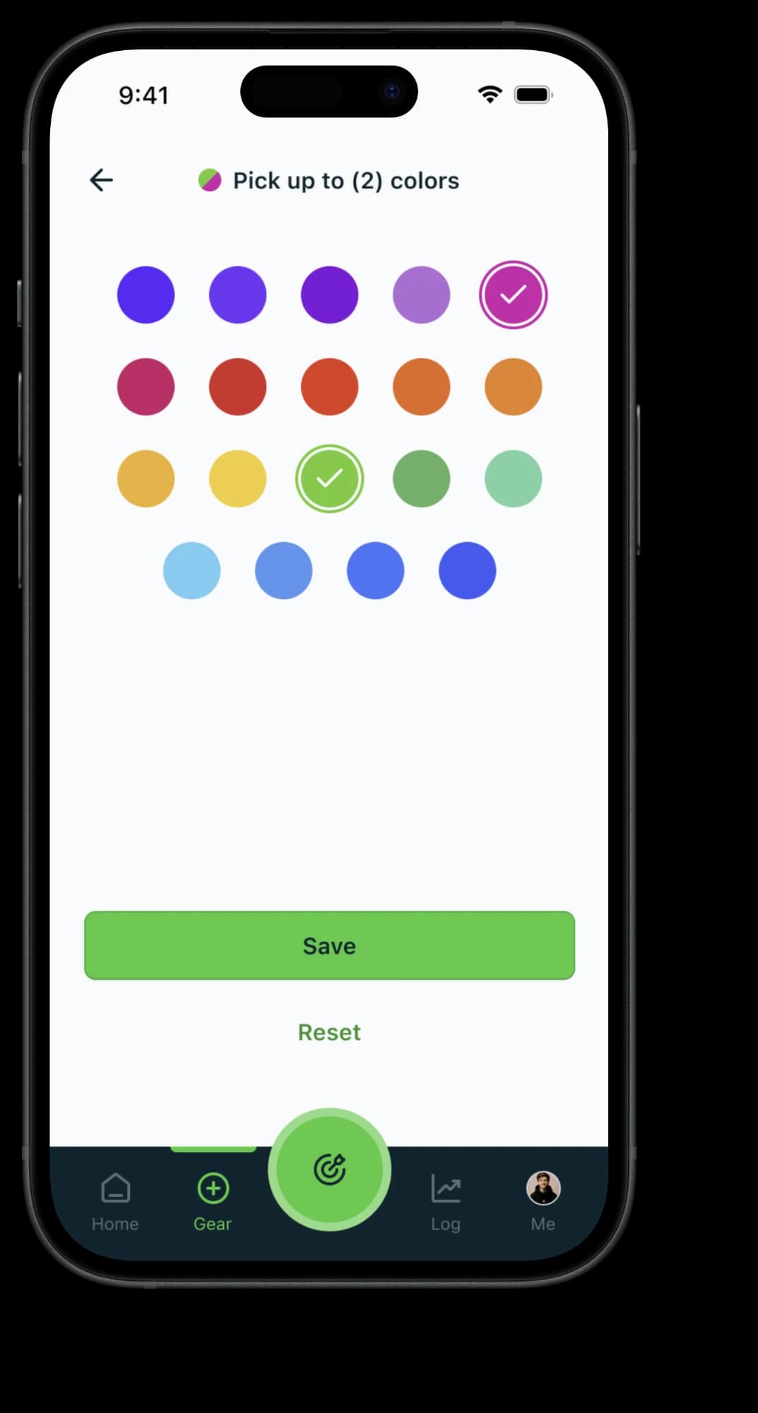
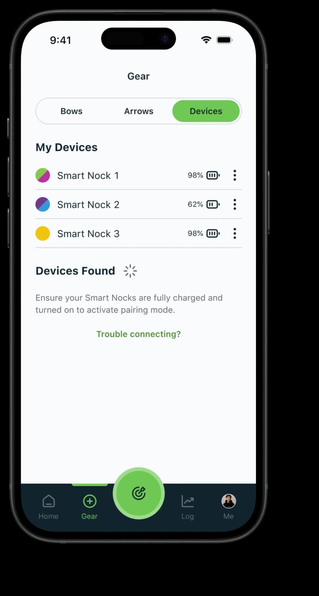
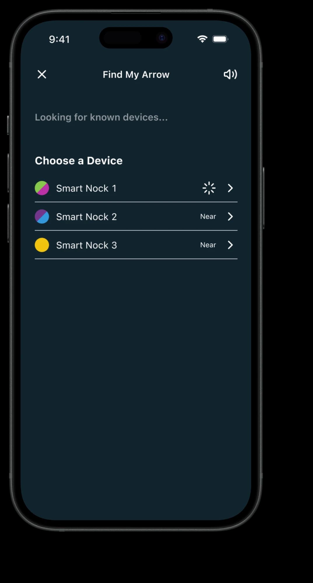
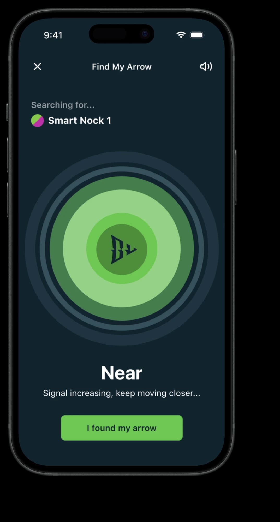
Identifying and finding nocks / A nock’s selected light colors appear alongside its name in setup, the device list, and recovery.
Giving archers a next step during recovery
I refined the existing Bluetooth proximity experience with distinct searching and connected states, explicit “Far” and “Near” labels, and instructions for what to do next.
The searching state prompts archers to move through the area while the app looks for their nock. Once connected, proximity labels and guidance communicate how to continue the search.
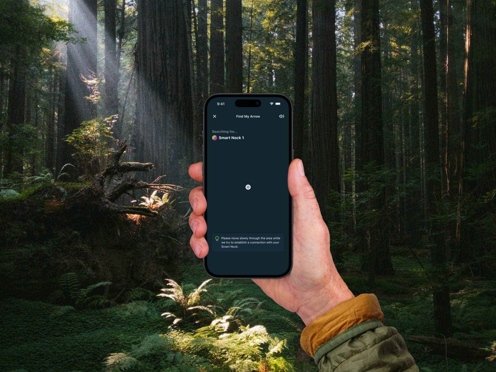
In the field / While the app searches for a nock, the interface provides an action to take: move slowly through the area to establish a connection.
Giving shot review and comparison a shared hierarchy
Using priorities identified with stakeholders, I organized results around speed, kinetic energy, and stabilization distance. I made existing game-size and distance guidance more prominent while keeping detailed measurements available below.
I extended that hierarchy into shot comparison. Users could select a second shot from their log or favorites and review paired measurements in one scrolling view. Consistent colors distinguished the shots, while gear details provided context for comparing setups and adjustments.
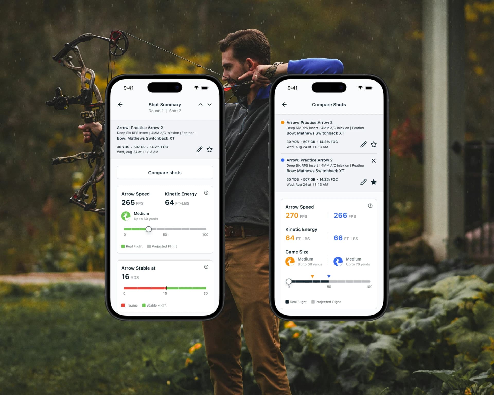
Understanding and comparing shots / Shot summary and comparison use a shared measurement hierarchy. In comparison, orange and blue distinguish the two shots, with equipment details available above the paired results.
Supporting the design through implementation
I worked with engineering to clarify interactions, adjust designs around technical constraints, and help QA the working app. After moving to another project, I continued providing occasional support while development progressed.
My contribution spanned the structure of gear setup, device identification and recovery, and the hierarchy of shot review and comparison. My involvement ended before launch, so I don’t have post-launch results to report.